Selected works combining illustration, typography, and concept-driven design across commercial and advocacy projects.
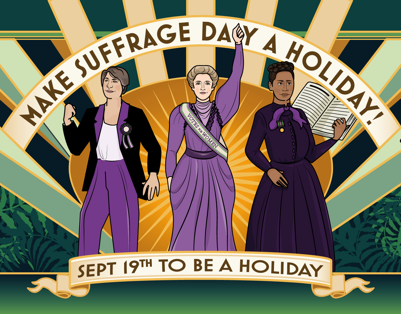
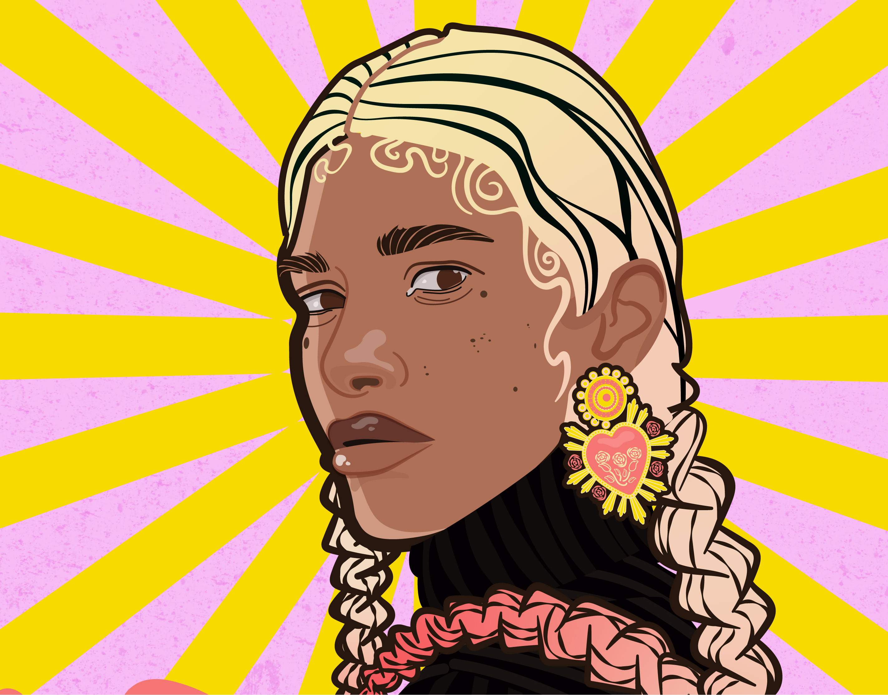
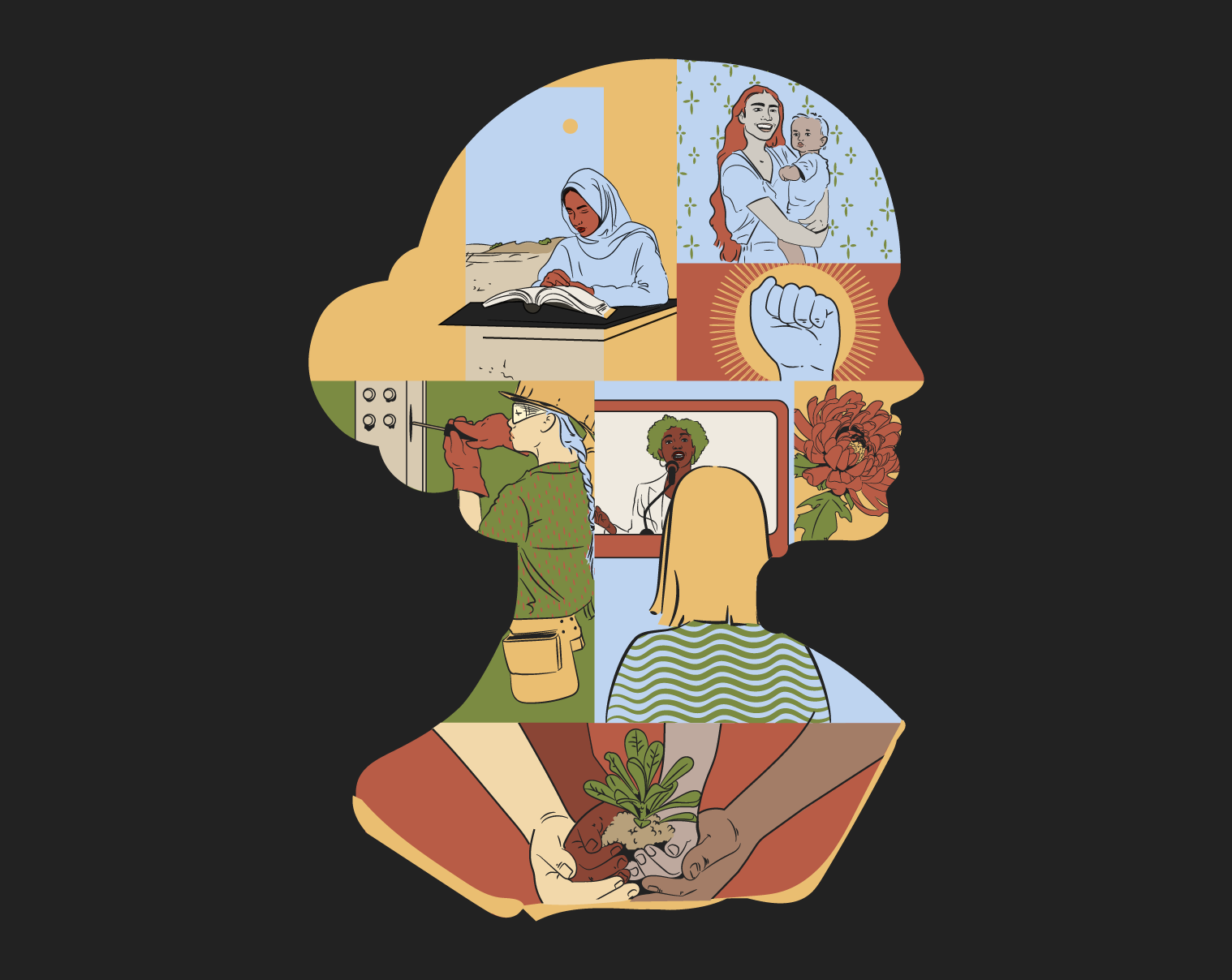
Congress & Court of International Women
Illustration & Concept Design | Volunteer Campaign
Developed to support the proposal for the Congress & Court of International Women. An initiative envisioned as a global platform amplifying women’s voices in evaluating and shaping world actions. With the design, I wanted to show unity through diversity; women from all walks of life, all backgrounds, standing together as a shared conscience for the world. Each element within the composition references moments of global women’s empowerment and collective strength, aiming to visualise the idea of women everywhere holding space, judging with empathy, and creating change through shared purpose. The piece combines strong illustration and symbolism to express wisdom, courage, and international sisterhood.
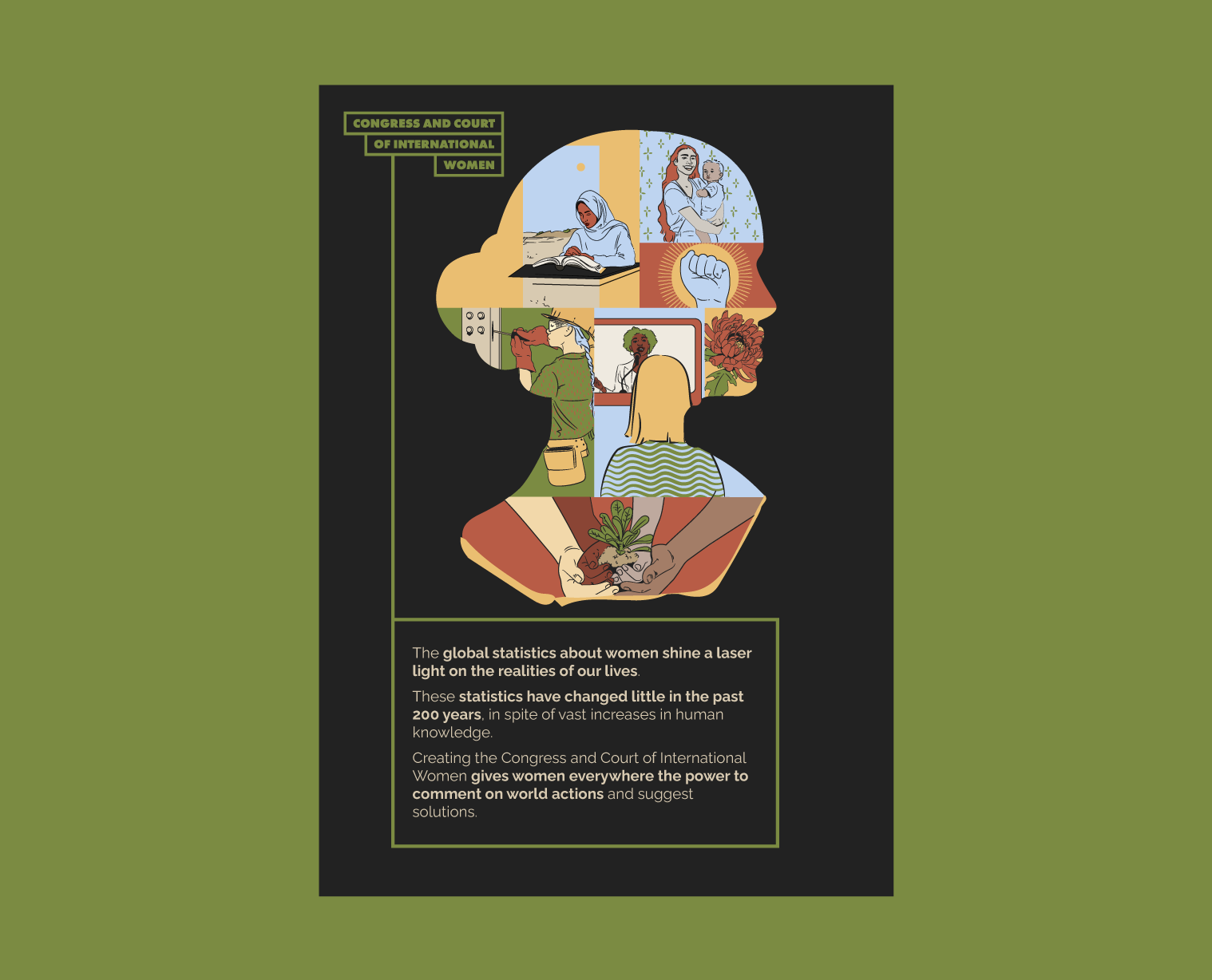
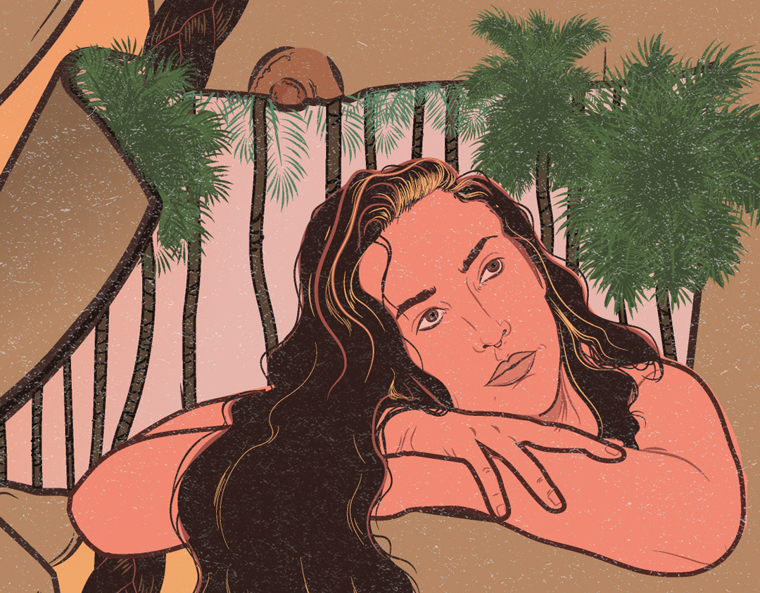
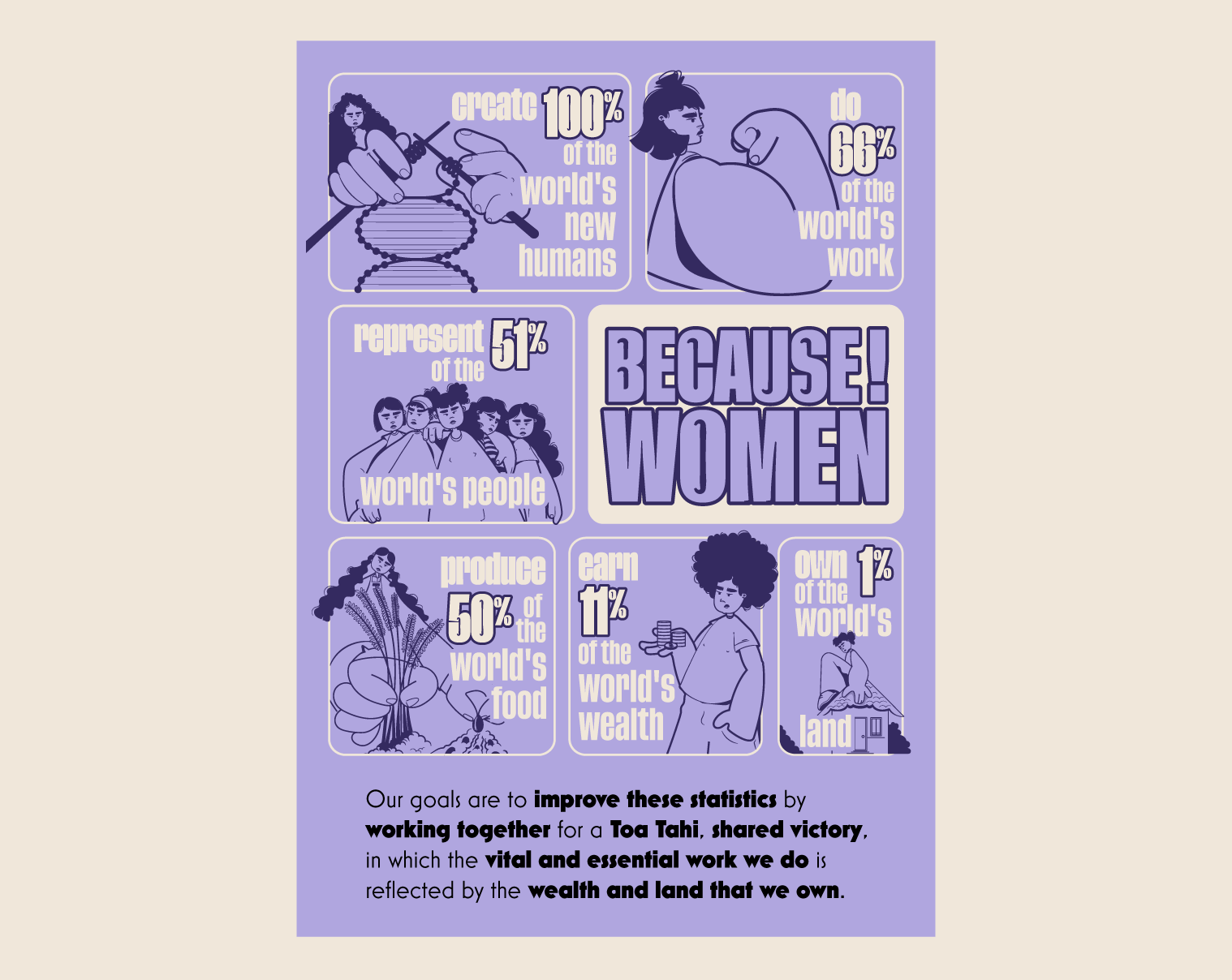
Toa Tahi
Illustration & Design | Volunteer Campaign
Created as part of a campaign proposal addressing gender equity and empowerment among young women in Aotearoa, Toa Tahi (“shared victory”) is a call for unity, awareness, and collective action. The poster was designed to resonate with girls aged 14–18
I wanted the poster to feel bold and unifying, encouraging young women to see their strength as collective. I used expressive illustration and strong typography to bring that message to life, building a visual system that could easily extend across multiple visual systems; a booklet, badge, or social campaign. The aim was to design something that feels current, empowering, and proudly inclusive.
I wanted the poster to feel bold and unifying, encouraging young women to see their strength as collective. I used expressive illustration and strong typography to bring that message to life, building a visual system that could easily extend across multiple visual systems; a booklet, badge, or social campaign. The aim was to design something that feels current, empowering, and proudly inclusive.

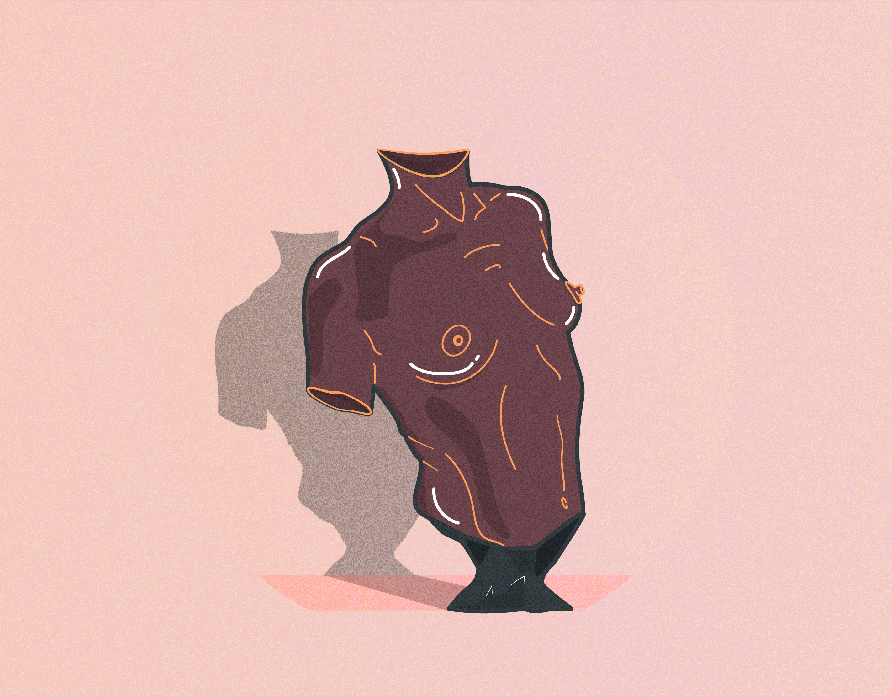
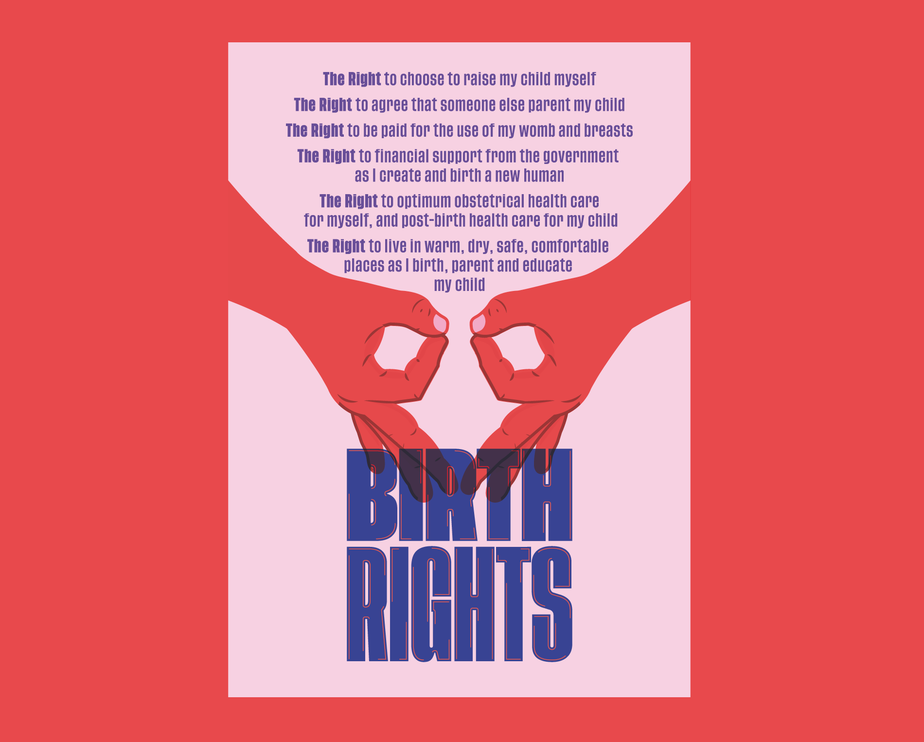
Birth Rights
Visual Campaign & Poster Design | Commissioned Project
Visual campaign championing the fundamental rights of those who choose pregnancy. The project explores how design and illustration can translate policy-driven ideas into emotive, accessible, and culturally grounded visuals.
Through two distinct poster concepts, the campaign balances symbolism with activism: one focused on collective empowerment and solidarity, and the other on the intimate, physical power of birth as a metaphor for rights being brought into existence.
Through two distinct poster concepts, the campaign balances symbolism with activism: one focused on collective empowerment and solidarity, and the other on the intimate, physical power of birth as a metaphor for rights being brought into existence.
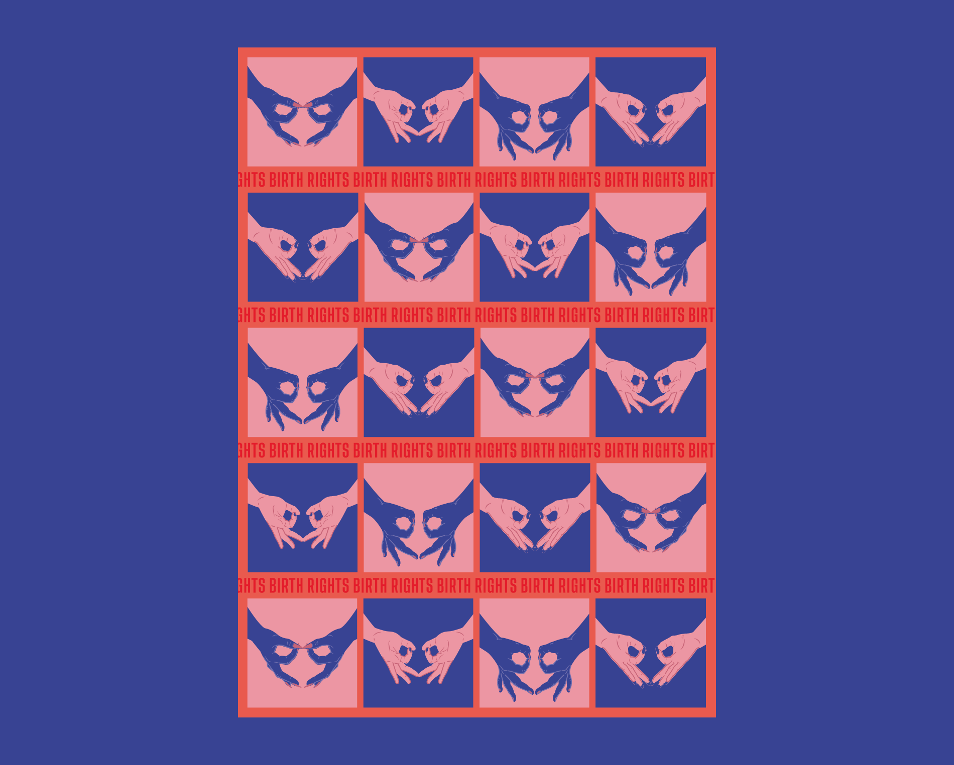
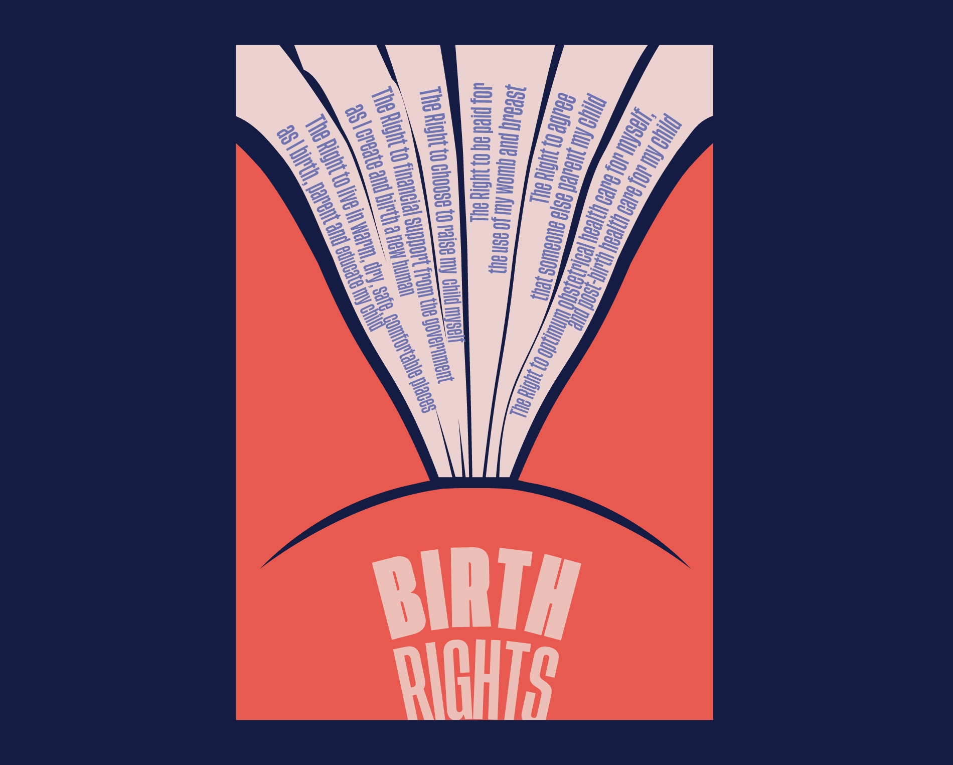
Concept 1 — “The Collective Hand” (Side A & B)
This version celebrates strength in unity. Side A features a grid of hands forming a shared uterine symbol; each hand different in tone, shape, and style to represent diversity. It’s designed to be both striking and uplifting, a piece that could be carried in protest or shared as a mark of solidarity. Side B brings the focus to the written rights, framed within one large hand symbol. This side feels more like an invitation, a call for engagement and alliance.
Wave & Ride Festival
Graphic Design & Illustration | Commissioned Project
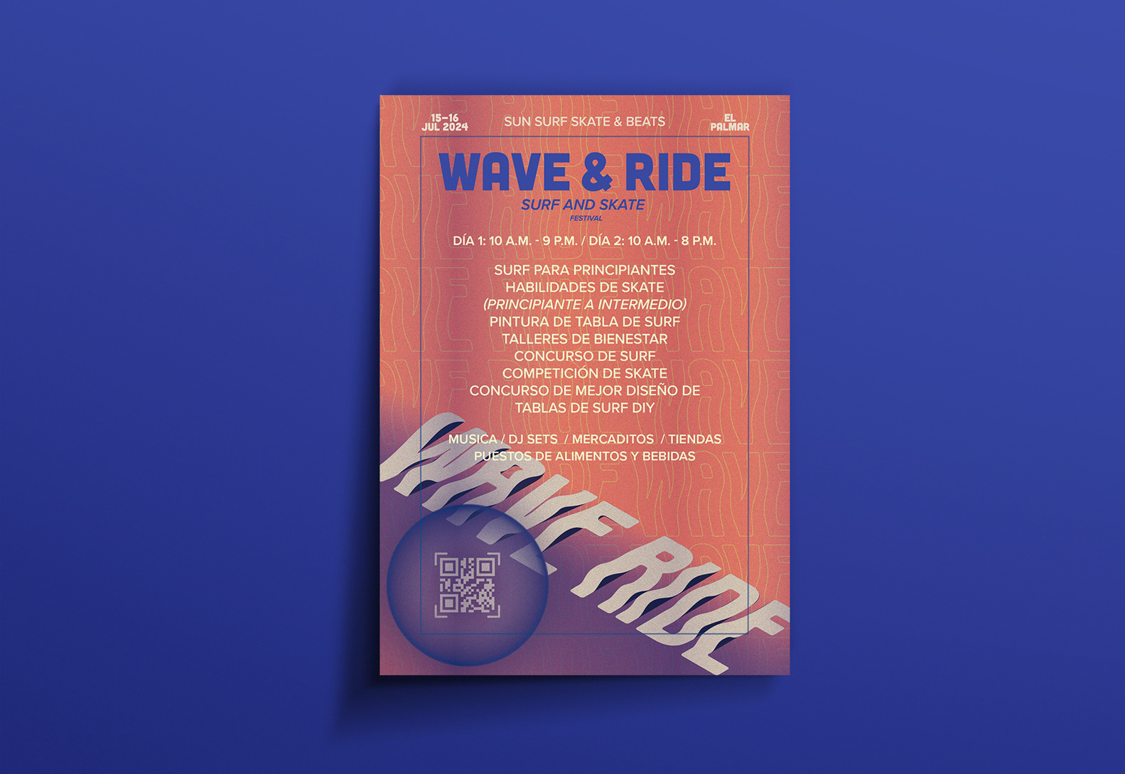
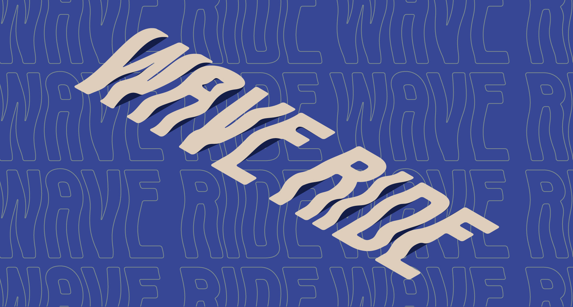
For these festival poster campaign, I focused on creating a design that connects to the cultural roots of both surfing and skating, drawing from their shared sense of nostalgia. By incorporating texture and grit, I wanted to capture the raw, energetic feel central to these communities. The emphasis on movement came to life through dynamic typography, which mimicked the flowing waves of the ocean and the smooth curves of a skate park. The contrasting palette and combination of hand-drawn flat text with 3D elements further enhanced this energy, providing depth and motion to the design.
This project was about more than just aesthetics; it was about promoting local talent and fostering community engagement. The event was a two-day celebration of competition, creativity, and local craftsmanship, and I wanted the poster to visually represent that vibrant, inclusive spirit.
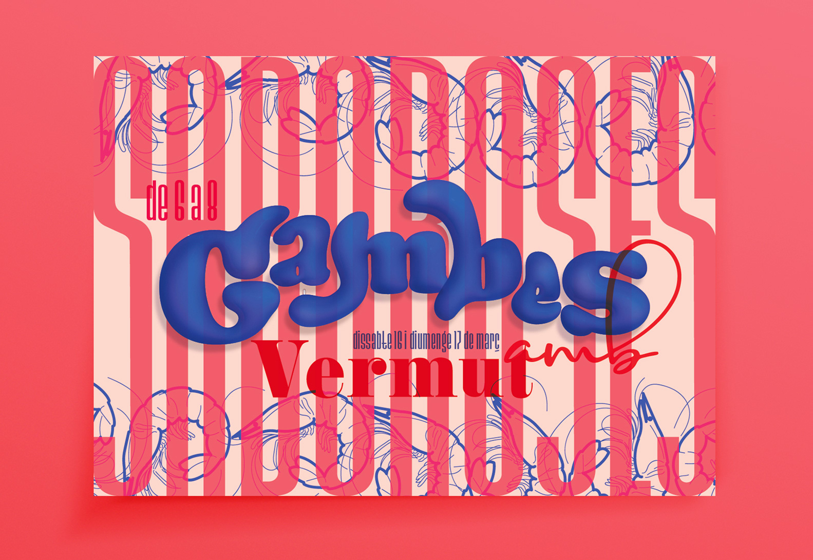
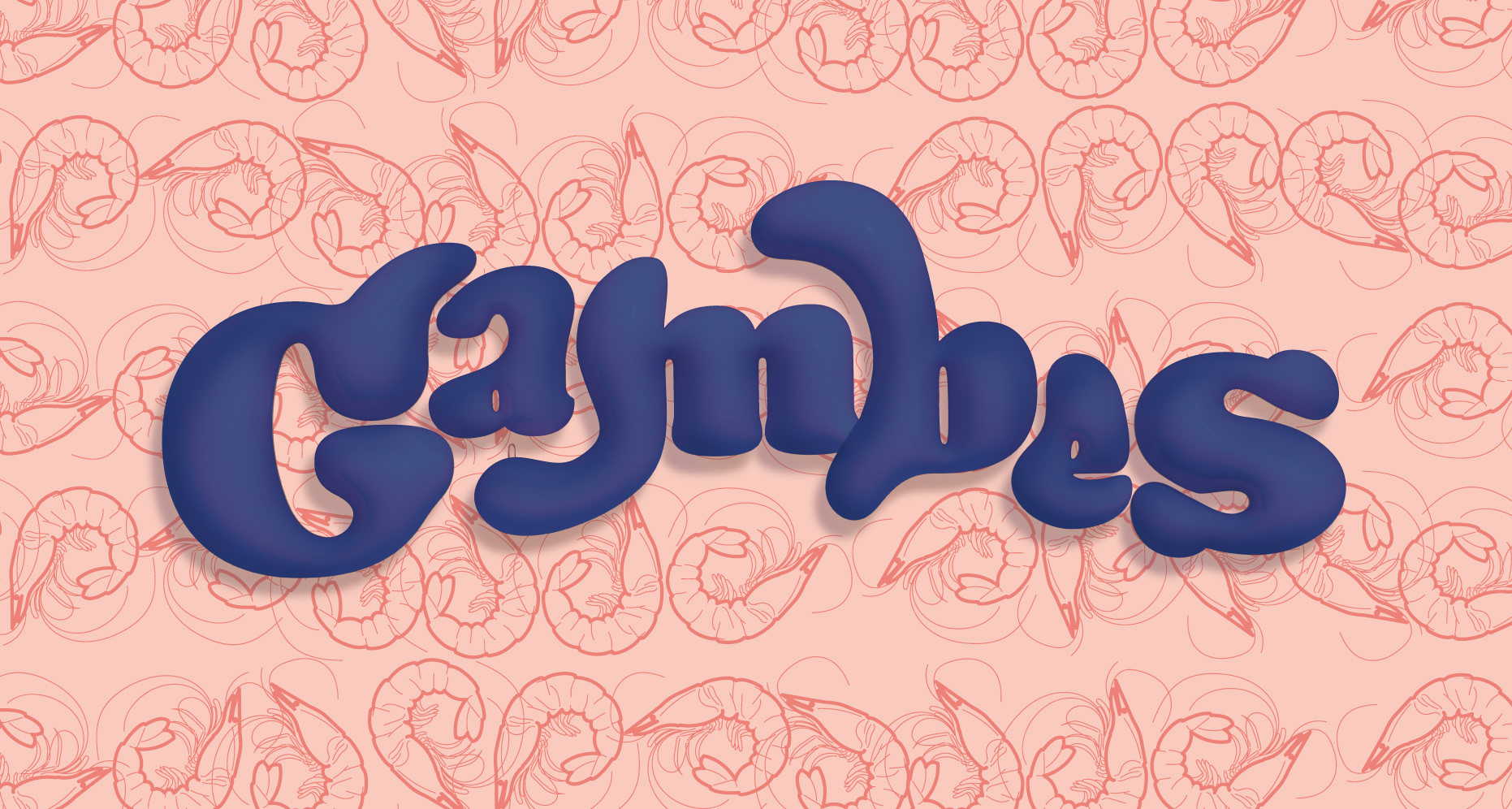
Gambes Sabroses
Graphic Design & Typography | Commissioned Project
bold and playful marketing poster created for a two-night event celebrating a prawn and vermut pairing night. The design merges handcrafted and 3D typographic elements, giving the poster a dynamic, layered feel.
Working with a contrasting colour palette to make the key visuals pop, combining flat, hand-drawn text with vibrant, dimensional typography to create a striking visual hierarchy. The posters were strategically placed inside and outside the venue to grab the attention of walk-by traffic and patrons alike, inviting them to enjoy a fresh and fun Catalunya culinary experience.